The layout of the Disney parks may not be something you think about except for at the end of the day when your feet are aching and sitting feels like the best ride ever. Or when you’re hiking around the Epcot World Showcase in the blazing sun and afternoon heat. But the ways the Imagineers have creatively designed the parks influence your experience more than you think, and in ways you might not have considered before.
So today we’re going to talk about why we love (or mostly love) Disney’s park designs and architectural illusions. And we’ll learn a bit about the history of Disney’s design along the way.
Let’s dive in, shall we?
We all know Disney creates the impression of height using forced perspective (or at least you do now!). Almost all the buildings on Main Street USA are designed with a 1—5/8—1/2 scale. The first floor is full scale, followed by the next facade floor being 5/8 before adding a third fake floor that is only 1/2 size. This illusion draws the eyes up and makes you think (from the ground) that the building is three stories when it actually is quite shorter. (Note: Main Street USA in the Magic Kingdom in Florida uses a 7/8 scale instead because it has a larger castle and so everything is sized up instead of “pony size” like Walt wanted at Disneyland).

This same effect is widely used in the parks, everywhere from Liberty Square to the tree stump atop Splash Mountain, and even the castles themselves. All buildings at Disney need to stay under 200 feet in order to not have to put lighting on the top for aircraft safety, which means even our beloved Cinderella Castle is only 189 feet high (though it looks quite a bit taller).


There are a few buildings on Main Street USA, however, that do not use forced perspective. One is Tony’s Town Square restaurant building, which needed to be tall enough to block the view of the Contemporary while in the parks and was therefore built with all its floors true-to-size.
Another is the Town Square Firehouse, which stands a full three stories because the original plans for the parks included an apartment for Walt’s family like its counterpart in Disneyland. As you may know, Walt sadly passed away before the opening of Walt Disney World, which made the apartment unnecessary. But as construction was already underway, the building was completed full-scale.

Forced perspective isn’t limited to the height of the buildings, however, on Main Street USA. The buildings themselves are designed to be at a slightly wider angle on one side of the building, so when you are traveling down the street towards the castle, it creates an illusion that the end of the street (and castle) is far away in the distance. When you turn around and head towards the exit after a long day, the street appears shorter and the end of the street manageably closer.
The trees also play a part in this visual trickery, as they are smaller as you look down the street towards the castle to make the magnificent structure appear larger and more impressive. The trees planted in the Town Square near the exit are larger and therefore create the illusion as you walk back to your resort that the train station is much closer.
And speaking of the walk back to your hotel room…
Walt had a term for the sore feet we often get after a long day of traipsing around the parks… he called it “museum feet”. His goal in designing the original parks was to avoid tired, aching feet as much as possible by creating useful walkways that connected people quickly to their destination.
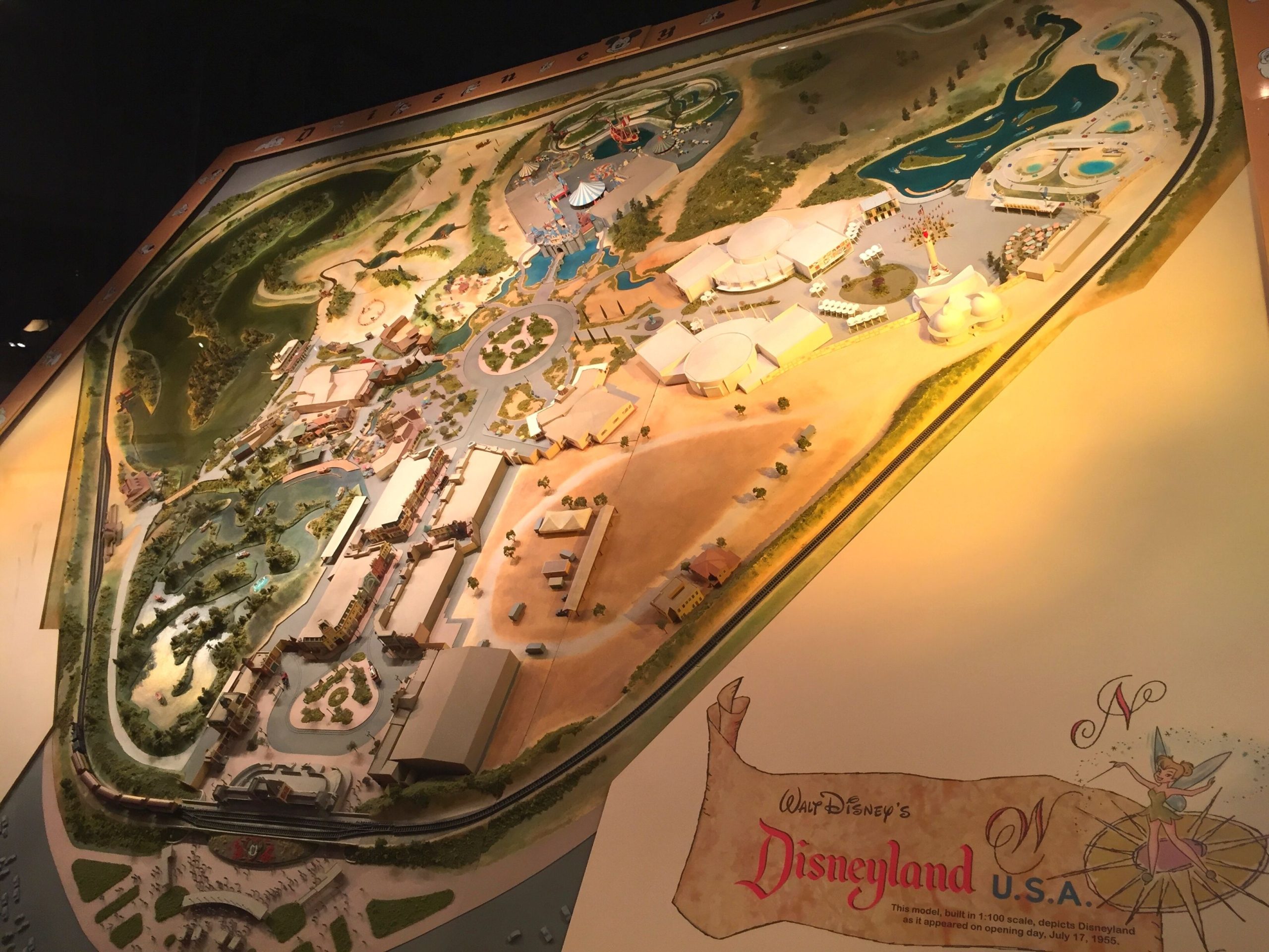
After traveling to Washington D.C. and seeing the French-born architect Pierre L’Enfant’s hub-and-spoke street designs, Walt proposed the same concept for Disneyland (if you’ve ever traveled in Paris, you’ll notice this is a common architectural street layout there as well). Below is a 1:100 scale model of opening day in Disneyland, where you can see this concept played out:

In this original design, every land is accessible via the hub in the center of the park. This hub, called “Central Plaza” or “Plaza” by Walt and the Imagineers (hence “The Plaza Inn” name) allowed for visitors to always have an anchor point to orient themselves to no matter where they were in the park. The castle itself became a visual reference for this anchor point.
But what Walt soon realized is that everyone had to backtrack back to the hub in order to get to another land, and that simply called for too much walking. So, secondary routes between each land were created at the back so that you could easily travel from land to land.
I am going to pause here and mention that, in my opinion, it is a major flaw in the design of the Magic Kingdom in Disney World that there is NOT a back entrance to Frontierland connecting it to Liberty Square/Fantasyland as there is in Disneyland. That walk from Big Thunder Mountain Railroad is ROUGH to backtrack around the Rivers of America on a hot Floridian day.

I digress.
Sadly, not all of the parks are laid out in this brilliant hub-and-spoke fashion. Epcot could easily be known as “Every Person Comes Out Tired” simply because of its massive double-circle design that arguably creates more steps needed than any other park. We could go on and on about why it’s that way (namely: it was supposed to be two separate parks and they pushed the two models together to create one large one) but that’s a whole other post for another day.

Animal Kingdom takes a page from the Magic Kingdom in design, with the hub being Discovery Island with the Tree of Life as a visual anchor. There are also walkways on the backside of all lands leading into the next land, much like Disneyland. This park feels smaller than it is at times because of this simple design that makes almost every area easily accessible. I particularly appreciate the bypass of DinoLand U.S.A., allowing me quick access to Expedition Everest without having to pass through that visually assaulting area.

It’s here I make my apologies to all the DinoLand fans out there… I love the cute Chester and Hester backstory, but would much rather have the defunct Beastly Kingdom area instead, quite honestly.
And now we come to an oft-controversial park that, at 72 acres, is one of the smallest of any Disney park, but is quickly becoming more beloved as it evolves. That’s right, I’m looking at you, California Adventure.

Where to start with this park? This is a question you may ask yourself when you enter it (from Buena Vista street OR the Grand Californian if you are a guest there). While the Carthay Circle Theatre is next to a small circular fountain, the lands are nowhere near connected by a central hub. And once you get back to Pixar Pier (top right in photo) or Radiator Springs Racers, you may find yourself with quite a trek back to the entrance. The visual anchor is arguably Grizzly Peak, but it’s not a clear center location point in any regard.
The fact is, it’s easy to get quite lost in this park. Case in point, while talking to a friend the other day, they didn’t know there were three entrances to Cars Land (and they were a Disney regular). That’s not surprising as the design is not intuitive in the least. It’s a sprawling, chaotic mess that is reminiscent of the lack of forethought that went into designing this park in the first place. Disney is doing a great job correcting its early mistakes of DCA with the Pixar retheming, the creation of the (beautiful!) Radiator Springs, and now the addition of Marvel, but it’s hard to hide the bad bones of structure that make walking around this park a little awkward, to say the least.
That being said, I have an abundance of love for California Adventure, and it’s become a family favorite. And the small footprint of the park makes it an easy stroll, even if we do get a bit lost at times. And who’s to say it’s such a bad thing to be lost while on Flo’s V-8 Cafe’s back patio watching the cars go by with a backdrop of Ornament Valley?

Which brings us to Hollywood Studios. A plethora of opinions abound about this park at the moment. Some love the layout, some hate it, but regardless, I think we can all agree its set-up is not the most convenient or intuitive.

The compact design of this park at just 135 acres makes it feel quite crowded even when it’s running at the same capacity as the rest of the parks. Even though it’s larger than the Magic Kingdom, the lands themselves do not have many vast open areas, therefore consistently channeling people into smaller walkways. I am pretty sure there are places I have never been in Hollywood Studios just because I didn’t know how to get there (or didn’t care to try to figure it out).
One could debate about what the visual anchor is for this park at the moment. Is it the Chinese Theater with Mickey and Minnie’s Runaway Railway? Or the Hollywood Tower Hotel, even all the way down at the end of the street? It used to be the Earffel Tower before they dismantled it for the addition of Toy Story Land(or the giant sparkly sorcerer hat that blocked the view of the Chinese Theater). It’s hard to say, though I lean towards the Chinese Theater as the center now that Mickey and Minnie’s Runaway Railway has become so popular.
Ok, Disney friends. Let’s bring it back to the original park, shall we? Let’s return to Walt’s design, where it all started.
One cannot talk about layout without discussing the brilliance of the Imagineers and what they have done with the postage-stamp size of Disneyland. At only 85 acres, this park has many more rides per the relative space as Magic Kingdom, and many of them opening-day (or Walt-concept) originals that still operate with only slight variations.

One of the most fascinating visual tricks is the way Disney places several rides in the same show building to save on space, changing only the facade on the outside of the building. Mr. Toad’s Wild Ride is on the first floor, while Alice in Wonderland climbs up to the second story to wind around above Mr. Toad. You can see the show building, which also includes Peter Pan’s Flight and The Mad Hatter gift shop in the photo below:

You probably have already heard about the “berm”, with the Disneyland Railroad atop it, which creates a visual barrier between you and the outside world while in the Magic Kingdom. What you may not know is that, in order to create the Haunted Mansion and the Pirates of the Caribbean, the show buildings had to be built outside the berm.
Ever wonder why Pirates of the Caribbean in Disneyland has two drops at the beginning of the ride instead of only one at Disney World?
Because you have to get below the train tracks, and into a separate building.
The same is true with the Haunted Mansion. As mentioned in my previous post about Halloween, the stretching room was designed solely to get everyone down a level in an elevator so they could walk down a long hallway underneath the berm. Imagineers and guests liked the gag so much that they replicated it in the Disney World version, but with the room stretching up instead of down since there was plenty of space for the show building right next to the stretching room. Well, technically they did plan to have elevators in the Magic Kingdom version of the Haunted Mansion, but they decided not to install them and changed their plans when Disneyland’s Haunted Mansion elevator shaft sprung a leak from the Rivers of America. The two elevators planned for Disney World still went to good use, however. One ended up in the Fantasyland stage, and the other currently resides sits under Cosmic Ray, raising him up and down as the need arises.
Anyway, back to Disneyland. You can clearly see in this photo below the two show buildings on the opposite side of the tracks:

I could go on and on for days about the layouts and intricacies within the lands themselves and how they are arranged for optimal guest traffic flow coupled with visual awe and wonder. That so many lands keep you closely within the theming without the intrusion of the surrounding areas is a magical feat unto itself.
The Imagineers have spent countless years hiding, sculpting, maneuvering, and designing ways for us to see the Disney parks in a specific way.
And that is why we love Disney. Because they not only care to bring us a beautiful Main Street USA but choose to make it magical in a way that goes beyond our understanding, creating a unique place that feels nostalgic even though none of us have ever lived in the early 1900s.
They invent space where there isn’t space, allowing us to believe that two rides can occupy the same location at the same time and that the Haunted Mansion could go on forever.
They turn an extra drop or an elevator ride into something we think of now as iconic when all it did was serve a practical need.
The magic is in the details, and all of this only scratches the surface of the Imagineering architectural design magic (don’t get me started about Liberty Square moving through time or the reason behind the name of the Seven Seas Lagoon!).
The next time you walk down Main Street, pause for a moment and take a glance at the second-story windows. Those names forever influenced the parks we know and love, and have altered our perspective in more magical ways than we’ll ever know.

Looking for more Disney History?
From a curated collection of Disney history that will inspire you to see the parks you love in a new way to a romantic suspense series featuring Disney history live streamers, there are always more obscure Disney details to discover!


For more Disney history with a dash of encouragement, subscribe below!